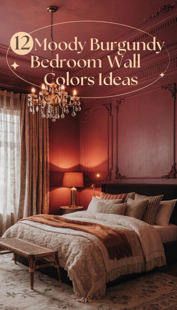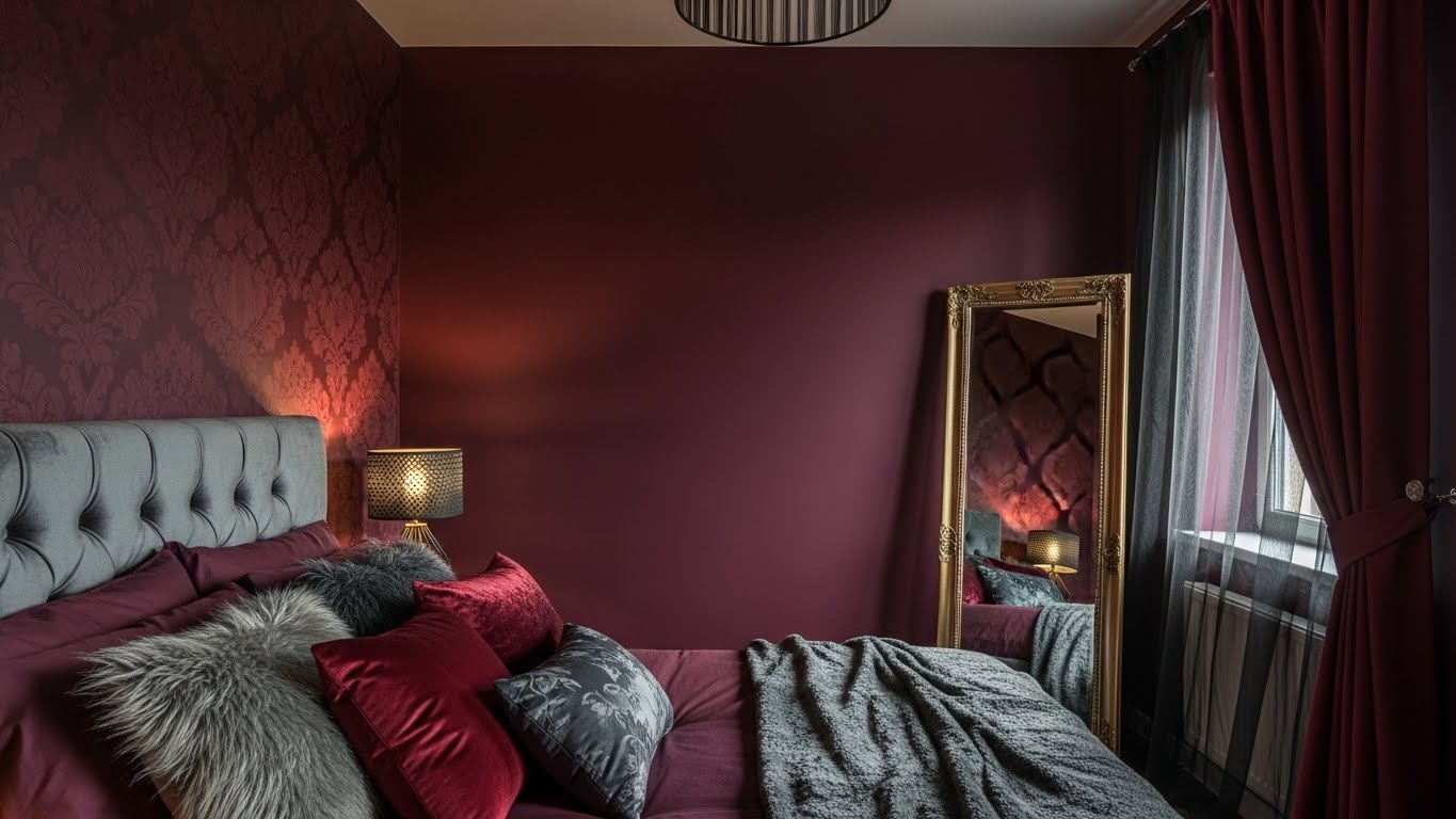
Burgundy is a beautiful choice for anyone who wants a bedroom with more character than a typical white or beige space. Its deep red tones can bring warmth to a room, while hints of purple, brown, or wine give the color a different personality depending on the shade you choose.
The best part is that burgundy does not have to make a bedroom feel old-fashioned or overly dark. Paired with cream bedding, natural wood, soft lighting, or carefully chosen metallic accents, it can look modern, romantic, traditional, or even minimalist.
Still, choosing the right burgundy takes a little thought. A room with large windows may suit a saturated wine-red wall, while a smaller bedroom with limited daylight might benefit from a softer, brown-based shade and lighter furnishings.
Below are 12 burgundy bedroom wall color ideas, along with practical suggestions for choosing bedding, furniture, lighting, and complementary colors. Whether you want to paint one wall behind your bed or create a rich color scheme throughout the room, these ideas will help you decide which direction suits your space.
Why Choose Moody Burgundy?
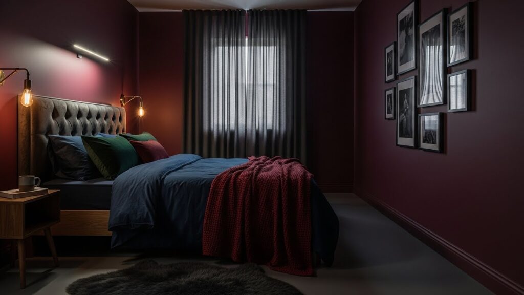
Unlike bright red, deep burgundy has enough brown, purple, or black in it to feel calm rather than energizing. It works especially well in bedrooms because it creates a cocooning effect, particularly in the evening when lamps and warm bulbs replace harsh overhead lighting.
Burgundy also gives you flexibility. It can suit a traditional room with dark wood and brass, a modern space with black metal and crisp white bedding, or a cozy cottage-style room with linen, rattan, and vintage art.
Before choosing, consider three things:
- Natural light: North-facing rooms may make burgundy look deeper and more purple; sunny rooms often reveal warmer red or brown undertones.
- Room size: Dark colors can visually pull walls inward. That can feel cozy in a large bedroom, but a small room may need lighter bedding, mirrors, or a pale ceiling.
- Finish: Matte or eggshell finishes usually make deep burgundy look softer and more expensive. Avoid high-gloss walls unless you specifically want a dramatic, reflective look.
1. New London Burgundy (Benjamin Moore)
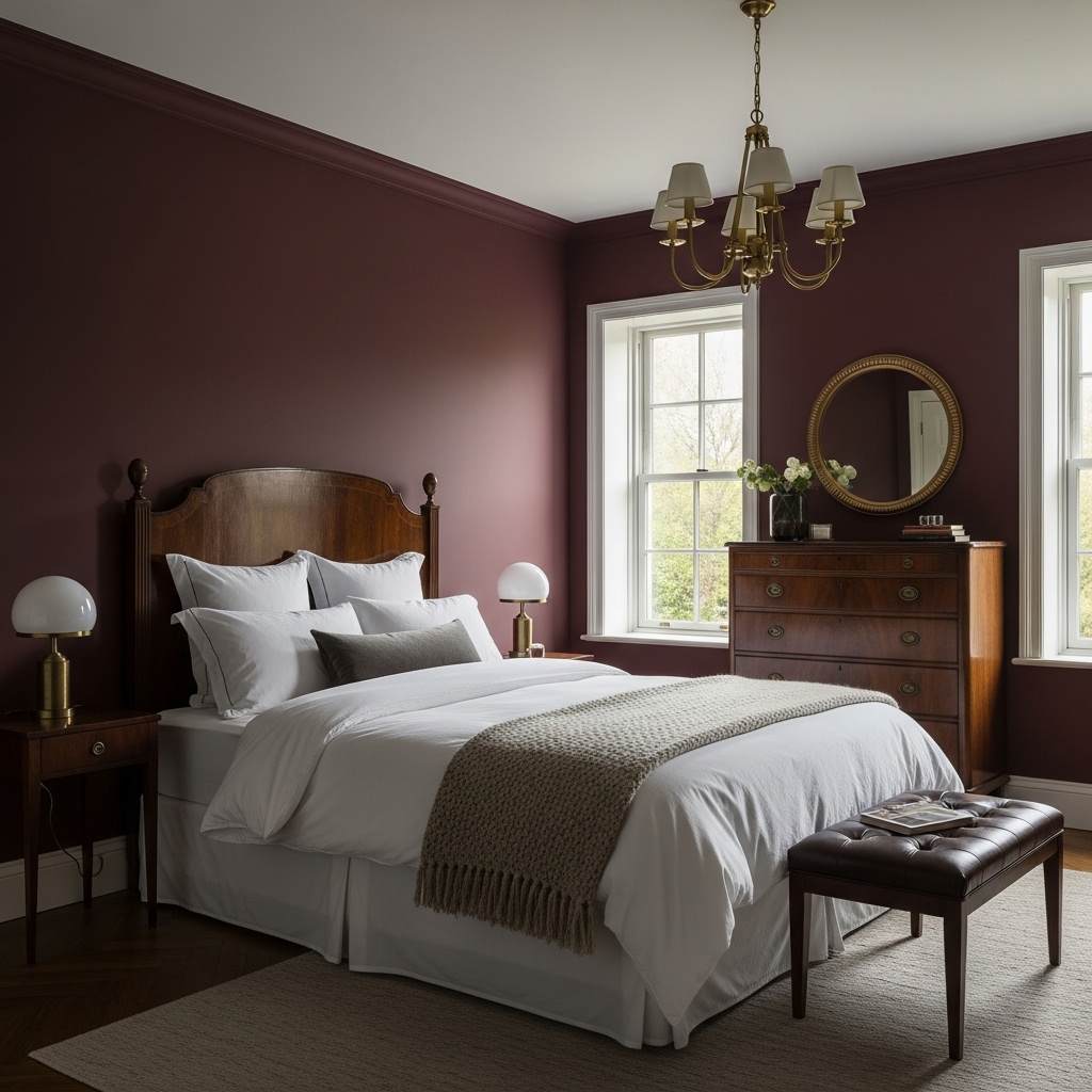
New London Burgundy is an option to consider if you want a bedroom with a traditional, grounded appearance. A deep red wall can complement dark wooden furniture, antique-style bedside tables, and warm metallic details without requiring an elaborate decorating scheme.
For a balanced look, pair the walls with ivory bedding, medium or dark wood furniture, and a textured beige rug. Cream curtains can soften the contrast between the rich paint and the rest of the room.
This combination is particularly appealing if your bedroom already contains wooden furniture that you want to keep. Rather than replacing those pieces, use the wall color to bring them together into a more deliberate design.
Best styling approach: Use burgundy on the wall behind the bed, then introduce cream bedding and brass bedside lamps. If you prefer a brighter room, keep the ceiling and most of the trim a warm white.
2. Preference Red (Farrow & Ball)
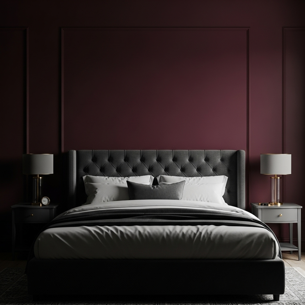
Best for: Dramatic, romantic, Victorian-inspired bedrooms
Pairs well with: Charcoal gray, black velvet, dark wood, antique brass
Preference Red is a deep, rich red with a formal, old-world feel. Farrow & Ball describes it as its deepest and richest red, with a Baroque character that works especially well in moody interiors.
Use it when you want the bedroom to feel enveloping rather than bright. Charcoal bedding, a dark upholstered headboard, and brass or aged-gold accents will enhance its depth. If your bedroom has limited daylight, embrace the mood with layered lighting instead of trying to make the color look lighter.
3. Fine Wine (Sherwin Williams)
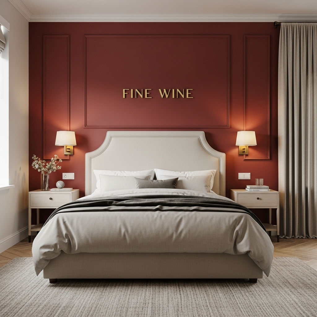
A wine-inspired red is a natural choice for a bedroom where you want the wall color to stand out. Depending on its undertones and the lighting, this type of shade can feel warm and inviting during the day and more dramatic after sunset.
One effective way to use it is behind the headboard. This creates a strong focal point without requiring every wall to carry the same intensity.
Pair the red with oatmeal curtains, a beige rug, and bedding in ivory or soft taupe. If your bed has a light upholstered headboard, the contrast can make both the furniture and the paint more noticeable.
Warm bedside lamps also help create a comfortable evening atmosphere. Choose bulbs that make your bedding and furniture look natural rather than relying on overhead lighting alone.
Best styling approach: Use wine red as an accent wall, then repeat small amounts of the color in cushions or artwork to connect the room visually.
4. Eating Room Red (Farrow & Ball)
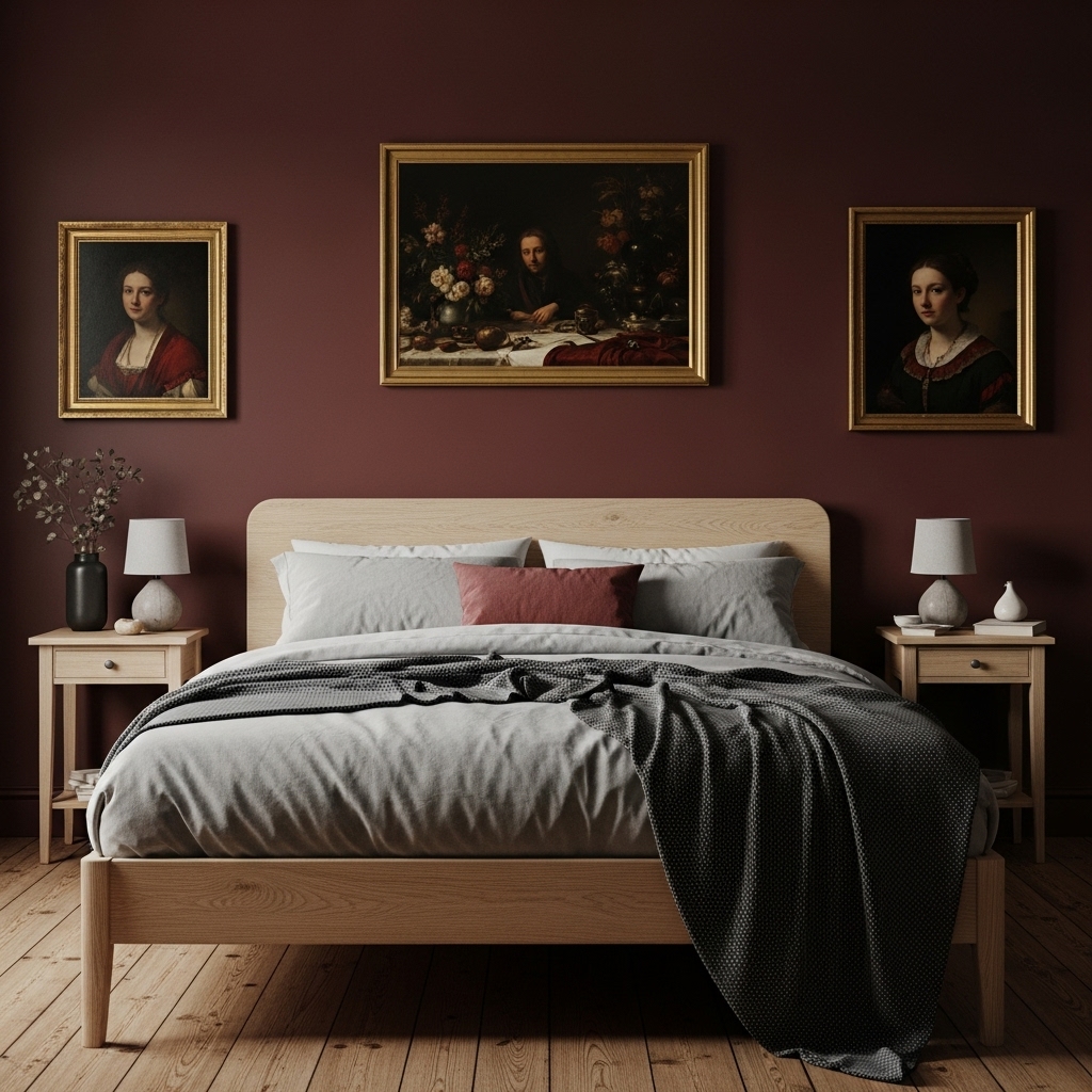
Best for: Cottagecore, rustic, and collected bedrooms
Pairs well with: Natural wood, linen, vintage paintings, muted greens
Eating Room Red has an aged, slightly dusty burgundy quality that feels comfortable rather than glossy. Farrow & Ball describes it as a rich burgundy with an aged feel, inspired by the red damasks popular in nineteenth-century dining rooms.
This is a strong choice if you want a bedroom that feels lived-in and characterful. Pair it with natural wood, woven textures, vintage frames, and soft neutral bedding. Avoid overly modern chrome accents here; aged brass, blackened metal, or ceramic lighting will suit the color better.
5. Rookwood Dark Red (Sherwin Williams)
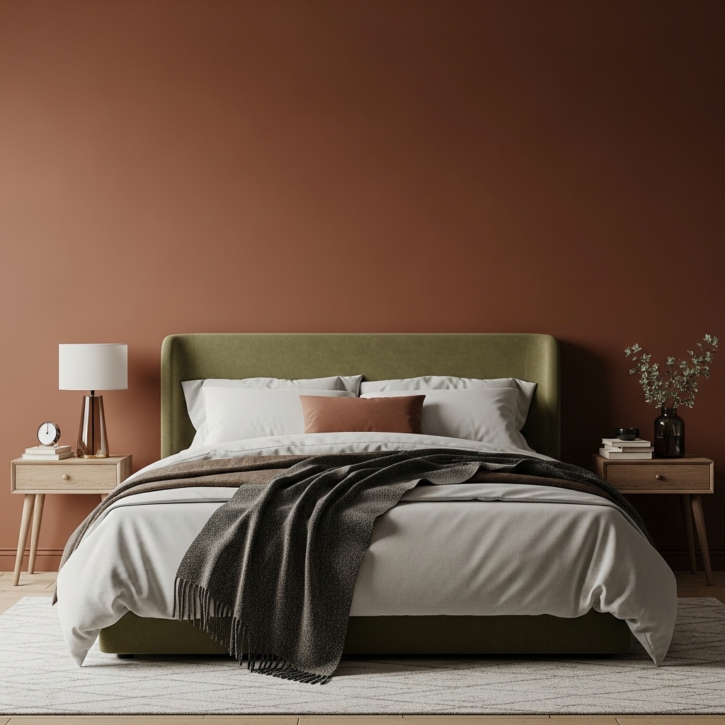
If bright red feels too energetic for your bedroom, a darker, earthier red may be a better direction. Brown-based reds can sit comfortably alongside wood furniture, muted greens, and warm neutral fabrics.
Rookwood Dark Red is worth considering for a bedroom with a traditional or rustic style. Olive green cushions, mustard-colored accents, and natural wood can create a layered palette without making the space look overly coordinated.
For a more contemporary result, keep the furniture simple and avoid combining too many patterns. A solid burgundy wall, a plain duvet, and one patterned cushion can provide enough variation.
Matte paint can help create a soft, understated appearance, although the most suitable finish depends on the wall condition and the manufacturer’s recommendations.
Best styling approach: Try earthy red walls with olive green accents, warm wood furniture, and neutral bedding. This palette is especially useful if you prefer natural colors over shiny metallic finishes.
6. Carter Plum (Benjamin Moore)
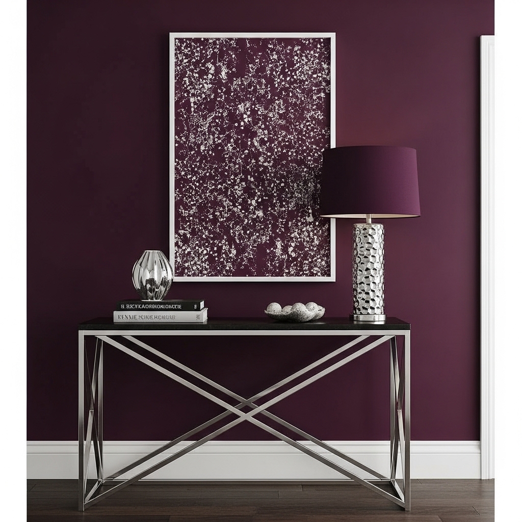
Best for: Modern, cool-toned moody bedrooms
Pairs well with: Charcoal, black, chrome, crisp white trim, gray linen
Carter Plum sits closer to the burgundy-plum boundary, so it is a good option if you want depth without a strongly rusty red undertone. Benjamin Moore lists it among its burgundy paint colors and notes that burgundy shades often fall between red and purple.
This shade suits a more contemporary bedroom. Pair it with charcoal bedding, black metal lighting, or chrome details for a boutique-hotel feel. Crisp white trim can add definition, while gray or off-white bedding keeps the room from becoming too dark.
7. Bronze Red (Little Greene)
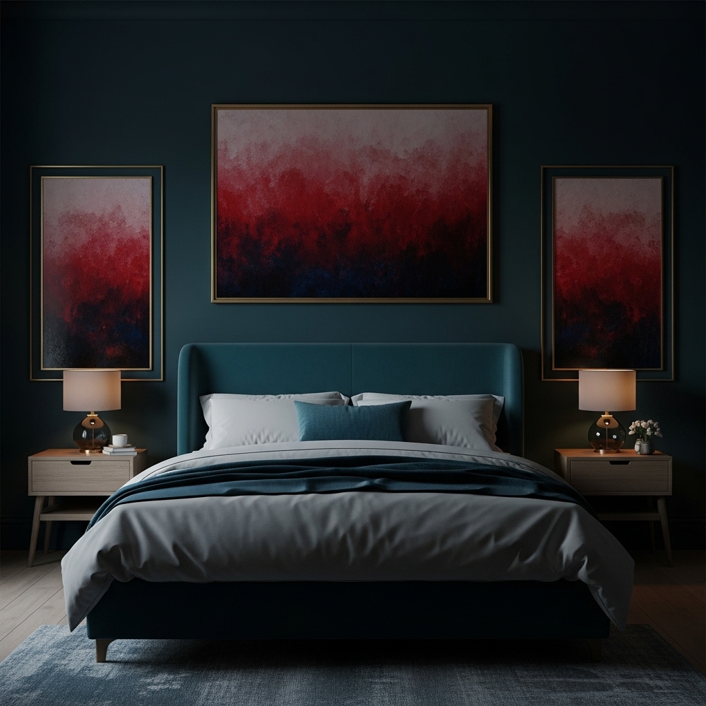
A deep red with earthy undertones can work beautifully in a bedroom that uses several rich colors rather than relying entirely on neutrals.
For example, burgundy-red walls can sit alongside muted teal cushions, dark blue artwork, and warm wood furniture. The combination creates contrast without requiring every color to be bright.
The important thing is to control the proportions. Let burgundy cover the largest area, use teal or blue in smaller accents, and keep bedding relatively simple. Otherwise, the room may feel visually busy.
This approach suits people who enjoy expressive interiors but still want the bedroom to feel organized. A few well-chosen accessories are usually more effective than filling every available surface.
Best styling approach: Use deep red walls with restrained teal accents, warm wood, and plain neutral bedding. Repeat the accent color in only a few places to maintain balance.
8. Polished Mahogany (Sherwin Williams)
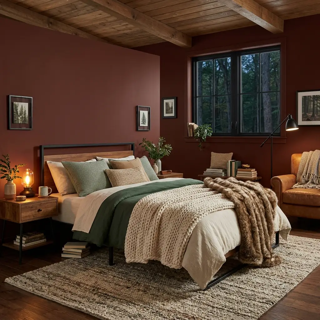
Best for: Cozy cabin-style and den-like bedrooms
Pairs well with: Chunky knits, faux fur, tan leather, warm wood, black metal
Polished Mahogany leans brown, giving it the warmth of stained timber rather than the brightness of a true red. It is ideal if you want your bedroom to feel like a private retreat or cozy cabin.
Layering is important with this shade. Use a chunky knit blanket, textured cushions, a wool rug, and warm lighting to keep the room inviting. Because the color already has brown depth, it pairs easily with neutrals, greens, and earthy accent colors.
9. Incarnadine (Farrow & Ball)
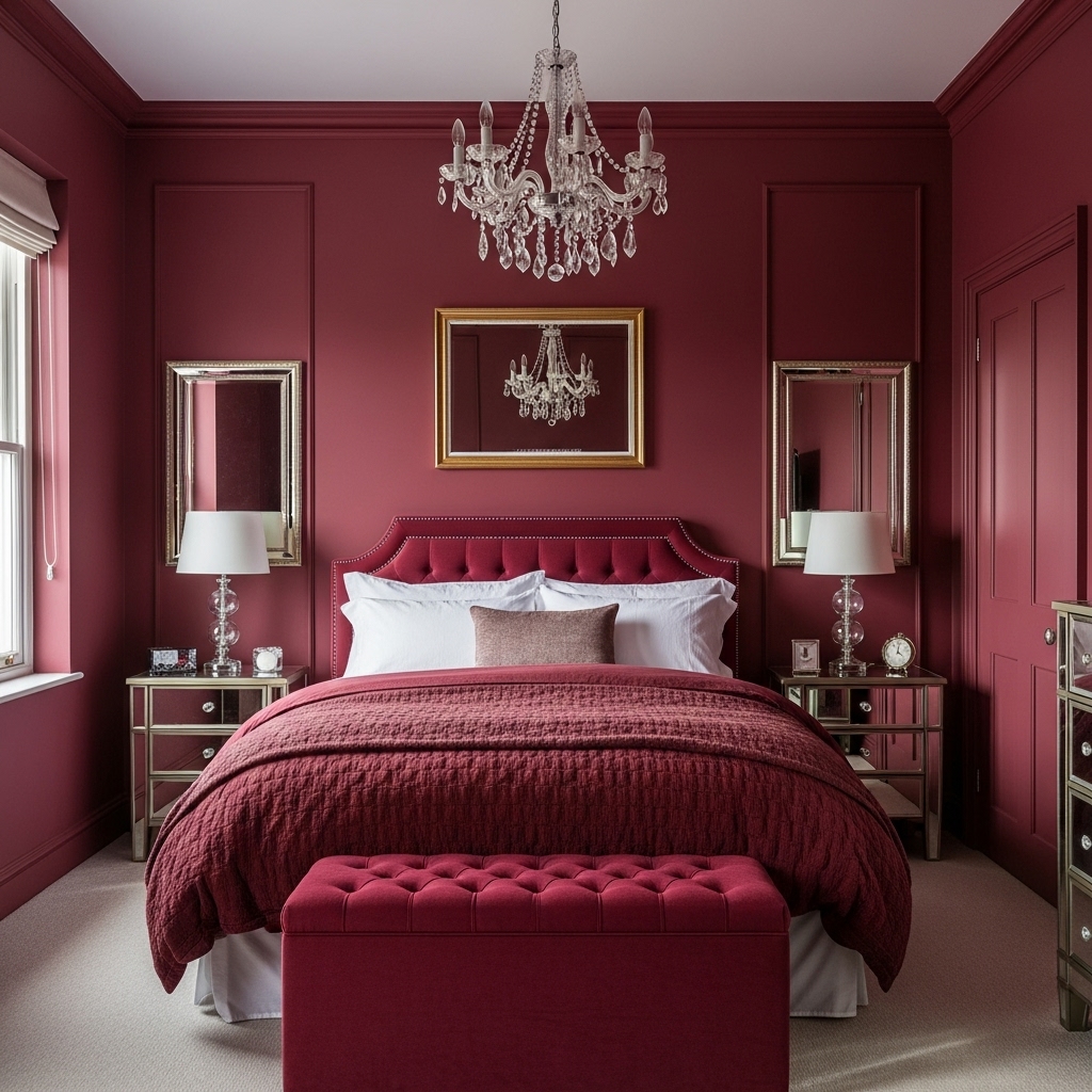
Best for: Glamorous small bedrooms and color-drenching
Pairs well with: Mirror, crystal, black, cream, brass, velvet
Incarnadine is a deep crimson with a more dramatic personality than a muted burgundy. Farrow & Ball groups it with its formal reds, alongside Eating Room Red and Preference Red.
This shade works especially well in a smaller bedroom where you want the space to feel intentional and luxurious. Consider color-drenching: paint the walls, trim, and door in the same shade to create a seamless “jewelry box” effect. Mirrored furniture, a chandelier, or reflective accessories can add light and dimension.
10. Caponata (Benjamin Moore)
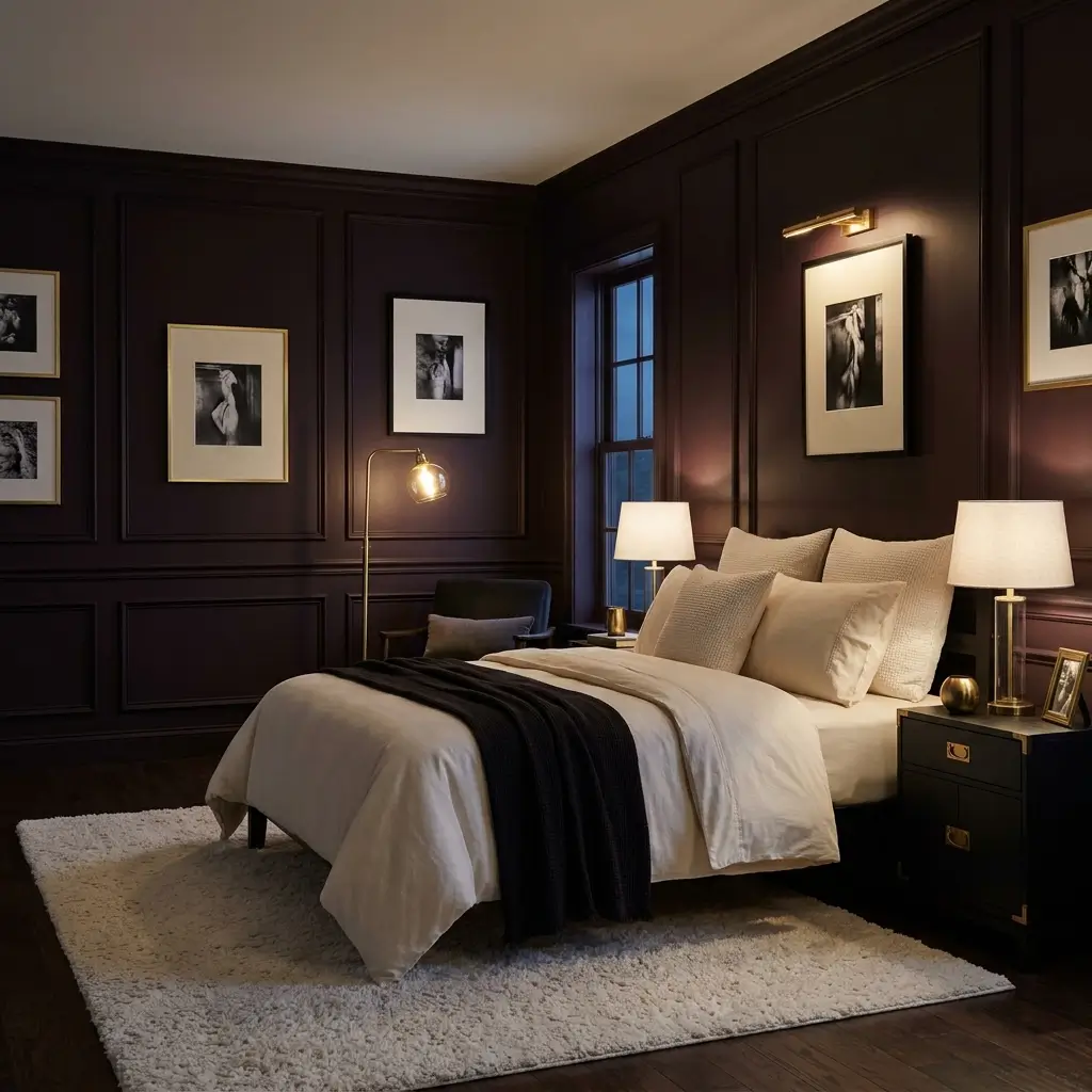
Best for: Very dark, sophisticated bedrooms
Pairs well with: Warm white lighting, cream rugs, black-and-white art, brass
Caponata is a chocolatey, purple-infused burgundy that can read almost black in low light. It is best for someone who genuinely wants a dark, atmospheric bedroom rather than a subtle accent color.
To keep it from feeling like a black box, use several light sources: bedside lamps, a floor lamp, and perhaps a small picture light.
A cream or light-colored rug, pale bedding, and artwork with lighter tones will create contrast and stop the room from feeling flat.
11. Cordovan (Sherwin Williams equivalent styling)

Cordovan-inspired burgundy takes its cue from reddish-brown leather. It is a useful direction if you want a bedroom that feels tailored, warm, and a little more understated than a bright wine-red interior.
Pair the walls with tan leather, dark wood, charcoal fabrics, and simple bedding. These materials complement the reddish-brown color without making the room feel too formal.
For a softer interpretation, introduce a cream duvet and light curtains. If you prefer a more industrial look, concrete-inspired textures and black metal details can add contrast, provided the room still has enough warm elements to balance them.
This palette can also work in a bedroom that doubles as a reading space. A wooden bookcase, a comfortable chair, and a warm reading lamp can help connect the different functions of the room.
Best styling approach: Use reddish-brown burgundy with tan, charcoal, cream, and natural wood.
12. Raisin (Sherwin Williams)
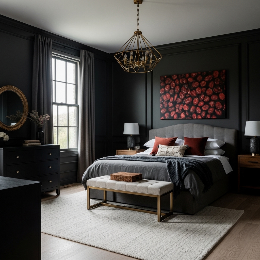
For a genuinely dramatic bedroom, consider a nearly black shade with subtle red or purple undertones. This approach is different from a traditional burgundy wall because the color may look almost black in low light and reveal more of its undertones in brighter areas.
A very dark wall can make a strong backdrop for white bedding, pale artwork, and light-colored flooring. It can also complement dark furniture, although combining several nearly black elements may make the room harder to visually distinguish.
If you like the idea but are hesitant to commit, begin behind the headboard. You can then decide whether the remaining walls should stay light or follow the same dark palette.
Pay attention to lighting as well. Bedside lamps and indirect lighting can make the room feel more layered, while a large cream rug can break up a dark floor-and-wall combination.
Best styling approach: Pair near-black burgundy with cream bedding, lighter flooring, and warm bedside lighting. Test a sample carefully because dark paint can look very different in daylight and at night.
How to Style a Burgundy Bedroom Without Making It Feel Too Dark
Choosing the paint is only part of the process. The bedding, curtains, furniture, and lighting determine whether the finished room feels balanced or overwhelming.
1. Choose bedding that complements the undertone
Cream and warm white are dependable choices because they contrast with dark red walls without looking too stark. Beige and oatmeal add warmth, while gray can work well with plum-based burgundy.
If you prefer patterned bedding, look for designs that contain one or two colors already present in the room. This helps connect the bed to the walls instead of introducing an unrelated palette.
2. Select curtains according to the room’s natural light
In a bedroom with limited daylight, lighter curtains can prevent the window area from becoming another dark block. Ivory, flax, and pale beige are useful options.
If your room receives plenty of sunlight, deeper curtains may work well, especially when they complement the wall color or upholstery.
You do not have to match curtains exactly to the paint. A slight difference in tone often creates a more natural, layered result.
3. Use lighting to reveal the color
Burgundy can appear different under daylight, warm bulbs, and cool white lighting. Before choosing lamps, consider the atmosphere you want in the evening and how accurately you need to see colors when getting dressed.
Warm-white bulbs around 2700K to 3000K are often a comfortable starting point for a bedroom. However, the result depends on the bulb, the paint’s undertones, and the other materials in the room.
Rather than relying on one bright ceiling light, consider a combination of bedside lamps, a ceiling fixture, and indirect lighting where practical.
4. Balance the wall color with different textures
Dark paint can look flat if everything else in the room has a similar smooth finish. Introduce variation through linen bedding, woven rugs, velvet cushions, wooden furniture, or a textured upholstered headboard.
There is no need to use every texture at once. Two or three complementary materials can give the room enough depth without making it feel cluttered.
5. Decide whether to paint one wall or all four
A burgundy feature wall is a sensible starting point if your bedroom is small, receives little natural light, or already contains dark furniture.
Painting all four walls creates a more immersive look. This can be effective in a room with a clear lighting plan and lighter furnishings to provide contrast.
Neither option is automatically better. Choose according to the atmosphere you want and how the room looks throughout the day.
How to Choose the Right Burgundy Paint Before Buying
Before purchasing several tins of paint, use this simple process to reduce the risk of choosing a shade that looks different from what you expected.
- Check the undertone. Compare red-based, brown-based, and plum-based samples. Decide which direction works best with your flooring, furniture, and bedding.
- Use a sample large enough to judge. Follow the paint manufacturer’s sampling instructions and evaluate the color on a reasonably large area or suitable sample board.
- Check it in different lighting. Observe the sample in the morning, during the afternoon, and after switching on your bedroom lights.
- Compare it with your existing furnishings. Place your bedding, curtain fabric, or a furniture sample near the painted area. A color that looks attractive on its own may clash with a warm floor or cool gray upholstery.
- Consider the paint finish. Matte finishes can reduce reflections and give walls a softer appearance. Eggshell or other washable finishes may be preferable where easier cleaning is important. Check the product specifications before deciding.
- Confirm the exact paint name and code. Paint names can be similar across brands, and a visual match is not necessarily an exact match. Use the manufacturer’s official color information rather than relying on a screen image alone.
Taking these steps before painting the whole room is often more useful than choosing a shade solely because it looks beautiful in an inspiration photograph.
Frequently Asked Questions
Does burgundy make a bedroom look smaller?
Dark burgundy can make walls feel visually closer, particularly in a small room with limited natural light. Some people enjoy this effect because it creates a more enclosed appearance.
If you want to keep the room feeling open, use burgundy on one wall, choose lighter bedding, and avoid making the curtains, flooring, and furniture equally dark. A mirror can help reflect light, although it will not change the room’s actual dimensions.
What colors go best with burgundy bedroom walls?
Cream, warm white, beige, tan, natural wood, and muted gray are all useful options. Olive green works well with earthy reds, while dusty pink and plum can complement cooler burgundy shades.
Gold or brass details can introduce warmth, but they are not essential. Black, silver, and dark wood can also work, depending on the undertone of the paint and the overall style of the room.
Is burgundy a good choice for a small bedroom?
Yes, provided you choose the shade and placement carefully. A single burgundy accent wall can add character without surrounding the entire room with a dark color.
If you want to paint all four walls, test the shade first and plan for sufficient lighting and lighter elements elsewhere in the room.
Should I paint all four bedroom walls burgundy?
Paint all four walls if you want a rich, enveloping atmosphere and your furniture and lighting can support it. If you prefer a brighter, more open look, begin with the wall behind the bed.
You can also keep the walls burgundy while using a lighter ceiling and lighter curtains to create contrast.
What color curtains work with burgundy walls?
Cream, ivory, beige, and flax-colored curtains are versatile choices. Gray can complement plum-based burgundy, while olive or muted green curtains can work with earthier reds.
The best choice depends on the wall’s undertone, the amount of daylight, and the color of your flooring. Compare fabric samples with the actual paint before buying full-length curtains.
What finish is best for burgundy bedroom walls?
Matte finishes are useful when you want a soft appearance with limited reflection. Eggshell and other washable finishes may be more practical if the walls need frequent cleaning.
Check the manufacturer’s recommendations and consider the condition of your walls before selecting a finish.
Can burgundy work with modern bedroom furniture?
Absolutely. Pair burgundy walls with simple furniture, clean-lined bedside tables, understated lighting, and neutral bedding. Avoid adding too many decorative elements if you want the result to feel contemporary.
Black accents, brushed metal, pale wood, and cream upholstery can all work, depending on whether the paint leans toward red, brown, or purple.
Final Thoughts
Burgundy bedroom walls can create a striking backdrop without requiring an entirely new set of furniture. The right shade can complement natural wood, soften a modern interior, or bring depth to a simple bedroom with neutral bedding.
The decision comes down to the undertone, the lighting, and the colors already in your space. Brown-based burgundy tends to suit warm, earthy palettes, while plum-based shades can work beautifully with gray and cooler neutrals. Near-black versions offer more drama but require careful attention to contrast.
Before committing, test your chosen paint alongside your bedding and furniture, and look at it at different times of day. A little preparation can help you avoid an expensive mismatch and create a bedroom that feels considered rather than simply dark.