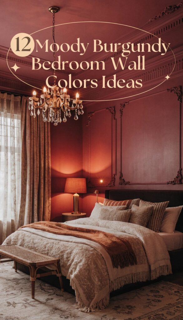
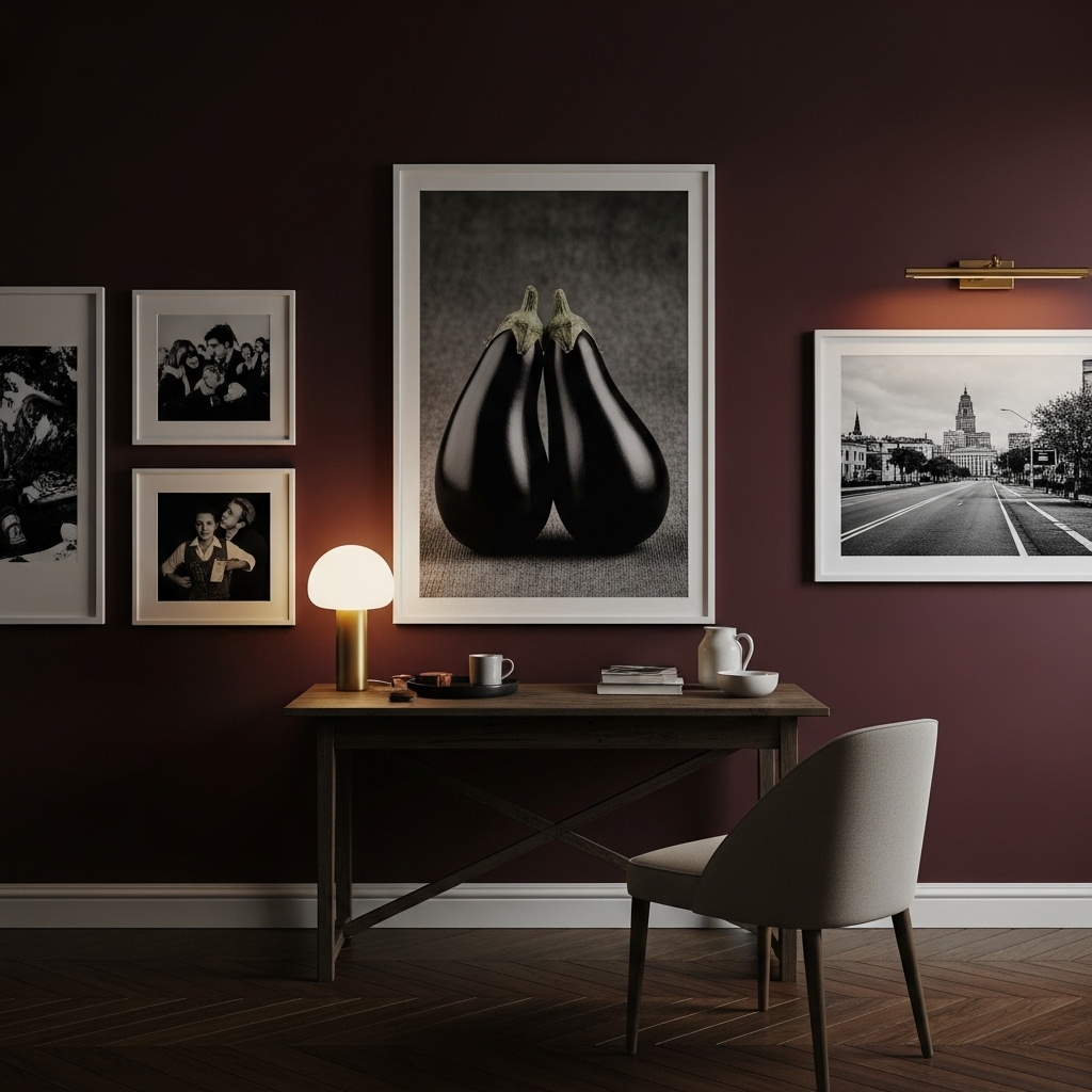
Redefining a bedroom as a cozy, romantic haven often starts with wall color, and burgundy delivers drama with depth. Rooted in rich red tones yet layered with subtle undertones, this shade feels far more refined than basic neutrals or harsh black.
It cocoons the space in warmth, striking a balance between intimacy and quiet luxury. Depending on the finish and lighting, burgundy can lean toward velvety wine, dusky plum, or earthy brown-red, each telling a different story.
From softly muted washes to bold, saturated statements, these twelve burgundy wall color ideas showcase how one moody hue can create bedrooms that feel elegant, inviting, and deeply personal.
Why Choose Moody Burgundy?
Burgundy is often associated with luxury, passion, and comfort. Unlike brighter reds which can be stimulating, deep burgundy has a grounding effect, making it surprisingly suitable for sleeping spaces.
It absorbs light beautifully, creating a “cocooning” effect that many find conducive to rest. Furthermore, it serves as an excellent backdrop for various design styles, from modern minimalism to Victorian maximalism.
Whether you accent it with gleaming gold hardware or soften it with natural linen textures, burgundy provides a versatile foundation for a character-filled home.
1. New London Burgundy (Benjamin Moore)
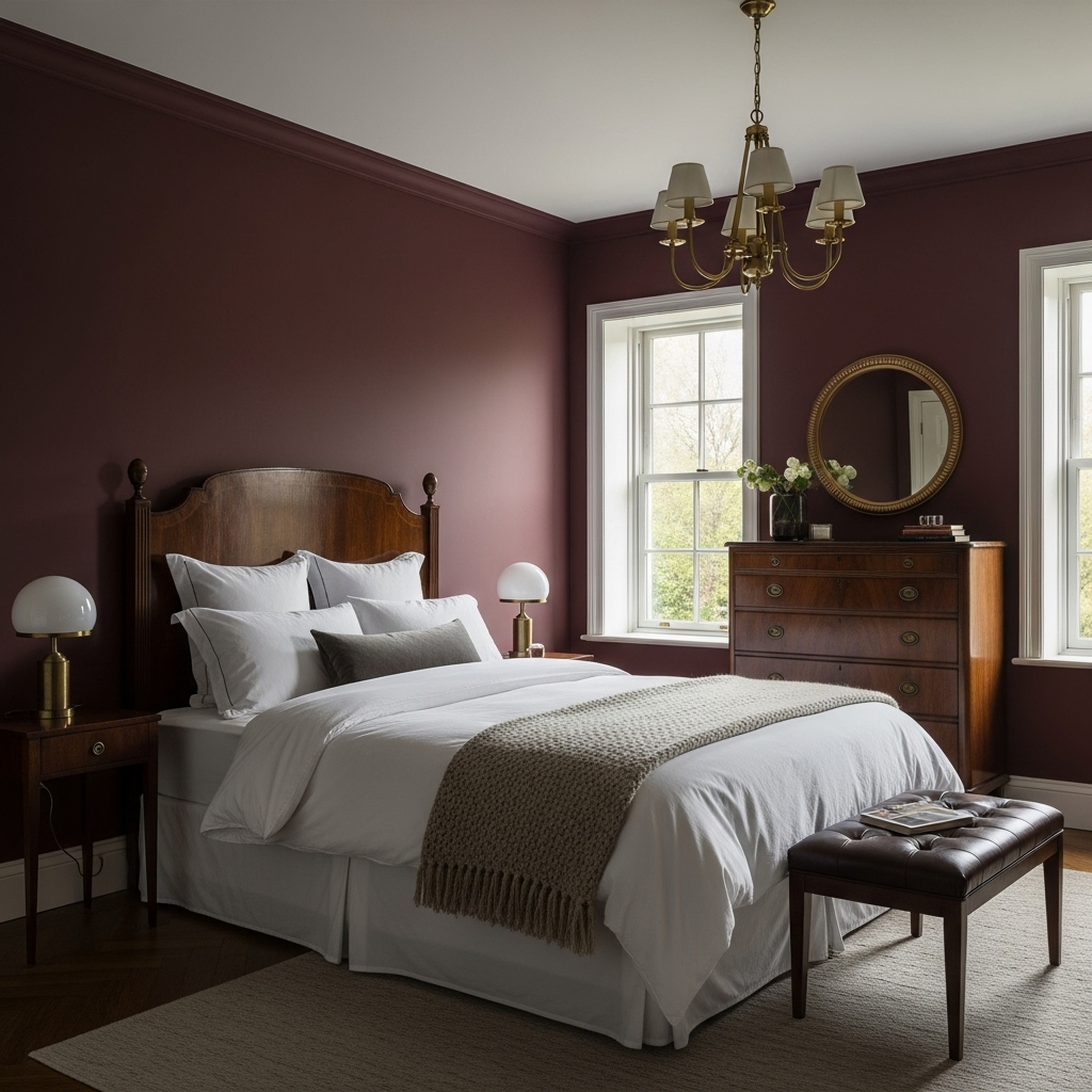
This timeless shade offers a quintessential approach to the moody aesthetic, blending deep red notes with a subtle brown base to ground the space.
It evokes the feeling of a historic library, making it perfect for bedrooms featuring dark wood antique furniture and brass accents.
To prevent the room from feeling too heavy, consider painting the ceiling a soft cream or pairing the walls with crisp white linens. The color transforms under evening light, becoming a rich, enveloping backdrop that encourages deep, restful sleep and sophisticated relaxation.
2. Preference Red (Farrow & Ball)
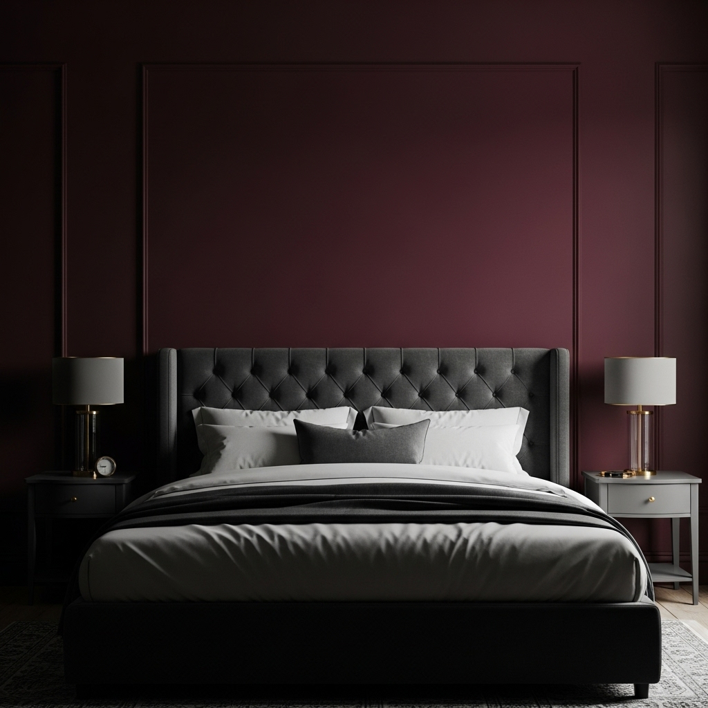
For those who appreciate a color with history and depth, this deep, rich Baroque red is an exceptional choice. It leans slightly towards a purple undertone, which gives it a regal and mysterious quality that standard reds often lack.
This shade pairs magnificently with charcoal grey upholstery or dark velvet headboards, creating a seamless, monochromatic look.
It is particularly stunning in rooms with low natural light, where its shadowy nature can be fully embraced rather than fought, turning a dim corner into a dramatic design statement.
3. Fine Wine (Sherwin Williams)
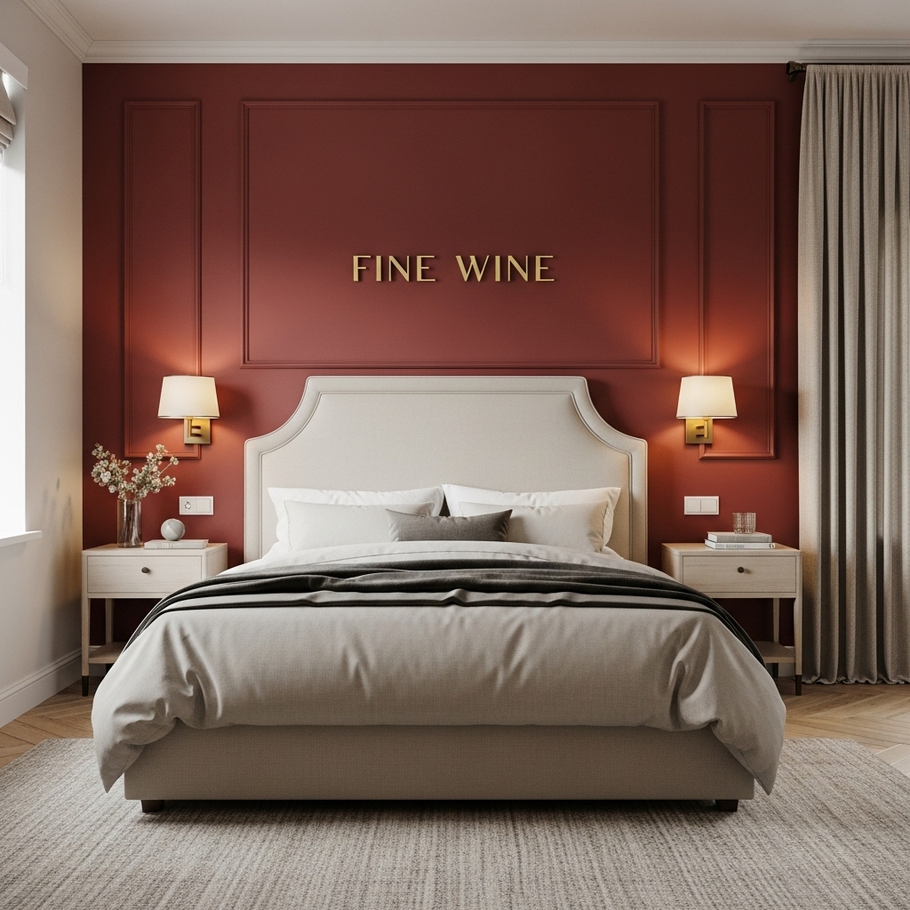
True to its name, this color captures the essence of a full-bodied merlot, offering a pure and saturated red that feels vibrant yet dark.
It works beautifully as a feature wall behind a bed, especially when flanked by sconces that cast warm, golden pools of light. The high saturation means it bridges the gap between modern energy and traditional elegance.
To balance the intensity, incorporate soft, neutral textures like a beige wool rug or oatmeal-colored curtains, which help the wall color sing without overwhelming the senses.
4. Eating Room Red (Farrow & Ball)
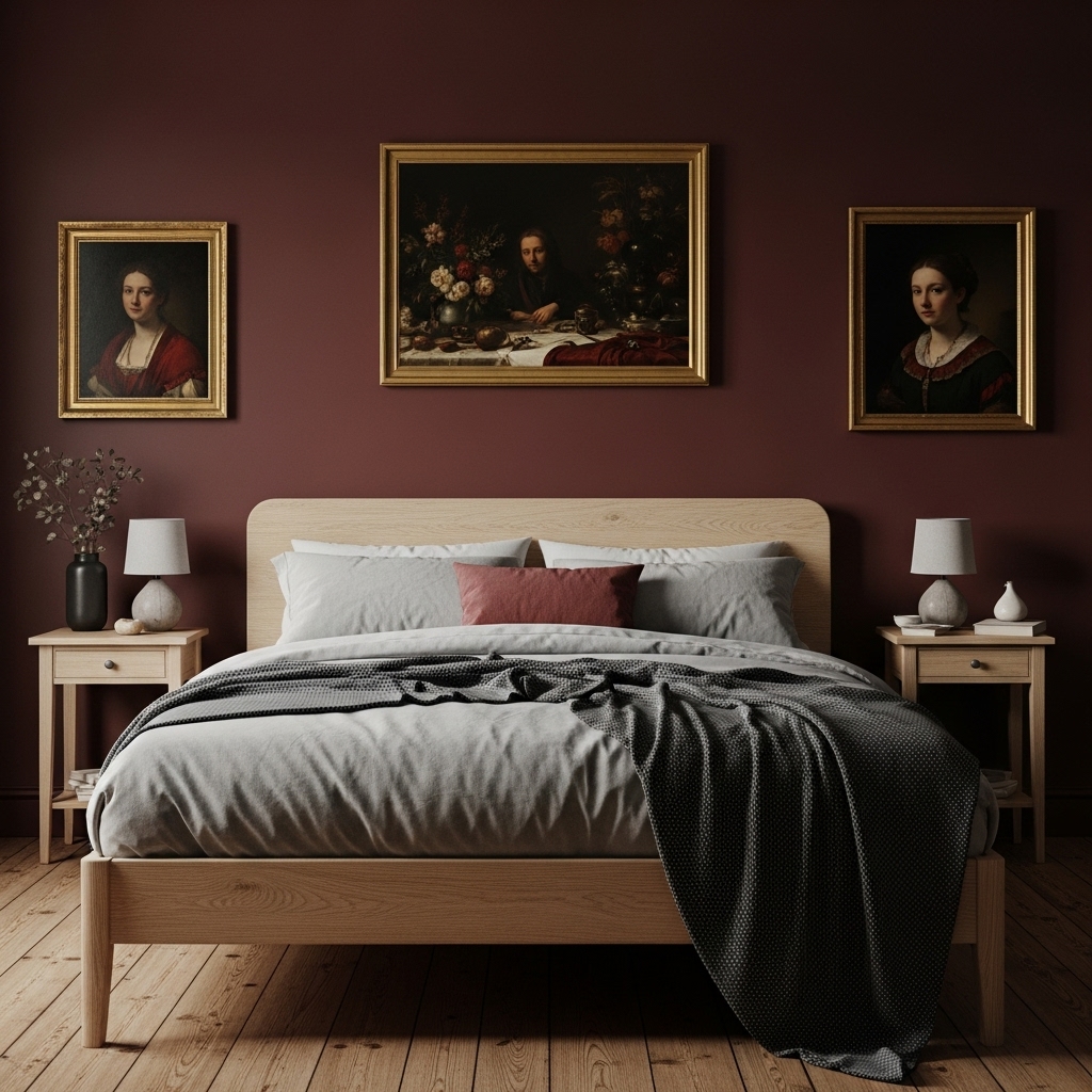
This pigment-rich deep red is famous for its ability to look like aged burgundy leather. It possesses a certain dustiness that makes it feel lived-in and comfortable right from the start, rather than shiny or new.
It is an ideal choice for a bedroom that aims for a rustic or “cottagecore” moody vibe. Pair it with natural wood finishes and vintage oil paintings to enhance its old-world charm. The color shifts dramatically throughout the day, appearing purpler in the morning and browner at night.
5. Rookwood Dark Red (Sherwin Williams)
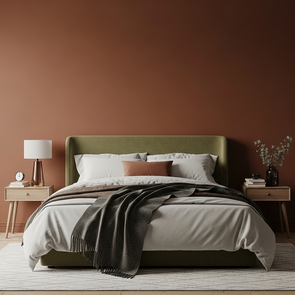
Drawing inspiration from the Victorian era, this shade is a brownish-red that exudes seriousness and stability.
It is less about romance and more about creating a studious, quiet atmosphere, making it perfect for a bedroom that doubles as a reading nook. The earthy quality of this paint allows it to harmonize with olive greens and mustard yellows for a rich, nature-inspired palette.
Use matte finishes with this color to enhance its velvety appearance, ensuring the walls look soft and touchable rather than harsh or glossy.
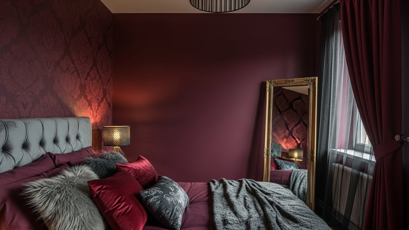
6. Carter Plum (Benjamin Moore)
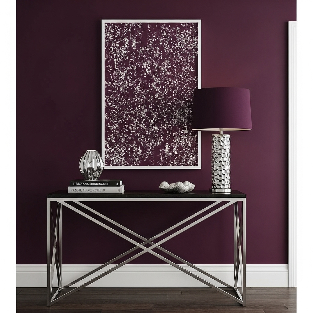
Sitting right on the border between burgundy and purple, this shade offers a cooler take on the moody trend. It is an excellent option for those who want the drama of a dark room but prefer cool undertones over warm, rusty ones.
This color looks exceptionally chic when paired with silver or chrome accents rather than the traditional gold. It creates a modern, boutique-hotel vibe that feels curated and expensive. crisp white trim is essential here to provide a sharp, clean border that defines the space.
7. Bronze Red (Little Greene)
Despite its name, this color is a dark, intense red with a deep connection to mineral earth tones. It has a unique vibrancy that glows under artificial light, making it a strong contender for bedrooms primarily used in the evening.
The “bronze” aspect refers to its warmth, which prevents the room from feeling cold or uninviting. It pairs unexpectedly well with teal or midnight blue accents, allowing for a jewel-tone palette that feels adventurous and artistic. It is a bold choice for a creative soul.
8. Polished Mahogany (Sherwin Williams)
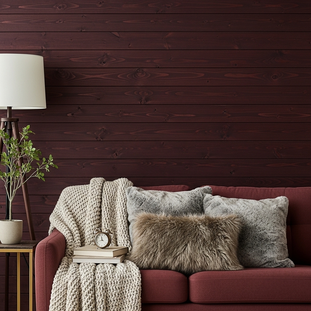
This shade is a deep, woodsy burgundy that leans heavily into brown, mimicking the look of dark, stained timber. It is the ultimate “cozy cabin” color, bringing the warmth of natural wood to your drywall.
It works best in spaces where you want to create a den-like feeling of safety and enclosure. To keep the look sophisticated, layer in plenty of textiles think chunky knit throws and faux fur pillows.
The brown undertone ensures it remains neutral enough to support various accent colors without clashing.
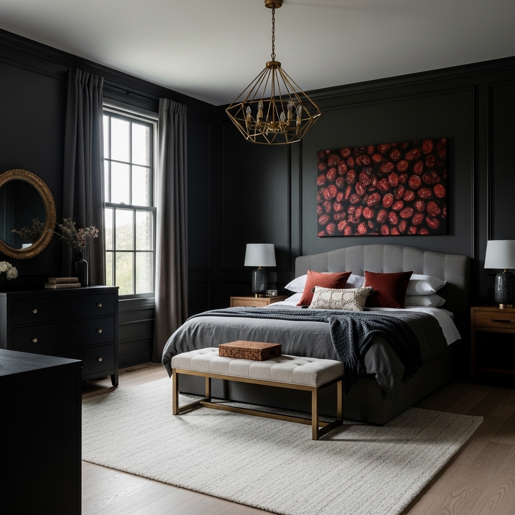
9. Incarnadine (Farrow & Ball)
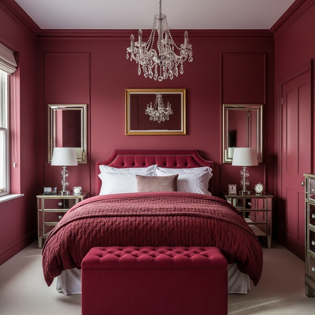
A classic crimson that has been deepened to a moody perfection, this shade brings a heartbeat to the room. It is unashamedly glamorous and works incredibly well in small bedrooms where you want to distract from the size by focusing on style.
Color-drenching, or painting the trim and doors the same color as the walls, works particularly well with this hue to create a seamless jewelry-box effect. A crystal chandelier or mirrored furniture can reflect the color, adding sparkle and dimension to the deep red surround.
10. Caponata (Benjamin Moore)
Named after the rich eggplant dish, this color is a chocolatey, purple-infused burgundy that is as delicious as it sounds.
It is darker and moodier than many other options, often reading as nearly black in dim corners. This creates an infinite depth that blurs the boundaries of the room, visually pushing the walls back.
It is a sophisticated backdrop for light-colored artwork or black-and-white photography. Use warm white bulbs in your lamps to bring out the hidden red cherry tones that lurk within this dark, mysterious shade.
11. Cordovan (Sherwin Williams equivalent styling)
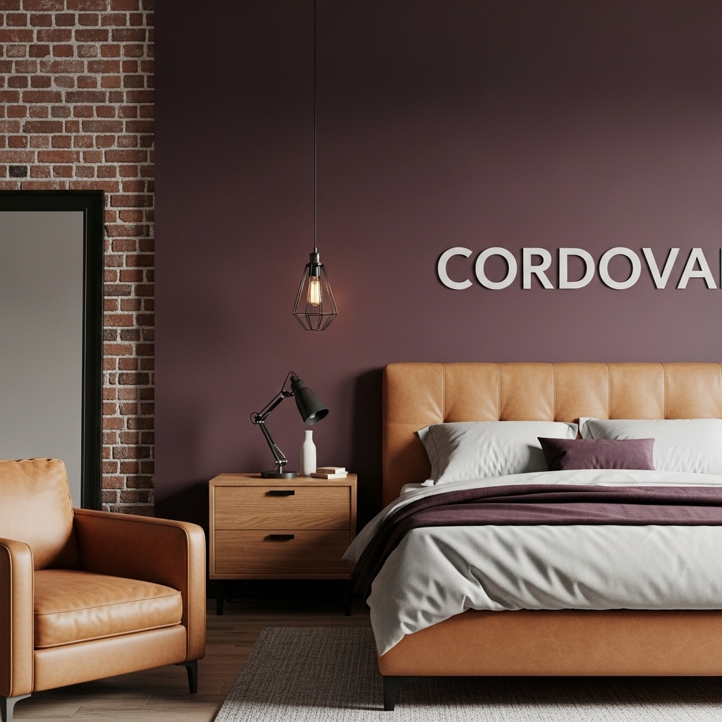
Inspired by the rich leather used in shoemaking, this color idea focuses on a reddish-purple shade that signifies high quality and durability. It has a sleekness to it that fits well in masculine or industrial-style bedrooms.
Exposed brick or concrete textures contrast nicely with this smooth, deep wall color. To soften the industrial edge, introduce leather furniture in a lighter tan shade.
The interplay between the deep wall color and the lighter leather accents creates a harmonious, monochromatic scheme that feels masculine yet invitingly warm.
12. Raisin (Sherwin Williams)
For the ultimate in moody atmosphere, this nearly-black shade offers only a whisper of red, resembling a dark dried fruit. It is for the brave decorator who is not afraid of the dark.
In a bedroom, it creates a cave-like silence that is perfect for light sleepers who need total darkness. To prevent it from looking like a black hole, use plenty of ambient lighting and light-colored flooring. A large, plush cream rug is almost mandatory to bounce light around and provide visual relief from the dramatic, inky walls.
Tips for Styling a Burgundy Bedroom
- Lighting is Key: Burgundy absorbs light, so ensure you have multiple light sources. Warm, yellow-toned bulbs (2700K-3000K) bring out the rich red undertones, while cool white bulbs can make the color look muddy or brown.
- Test Your Samples: Always paint a large swatch on your wall and observe it for 24 hours. Burgundy changes drastically from morning to night; what looks like wine in the daylight might look like brown mud in the evening.
- Texture Balance: To keep the room from feeling flat, mix textures. Velvet, silk, and linen add dimension to the solid wall color. A high-gloss finish on the trim against matte walls can also add a modern, sophisticated touch.
Conclusion
Embracing a moody burgundy palette is a bold design move that pays off in style and comfort. Whether you prefer the historic weight of a brownish-red or the romantic flair of a purple-leaning wine, there is a shade to suit your vision.
These colors transform a simple bedroom into a sanctuary, encouraging rest and providing a stunning backdrop for your life. By carefully selecting your shade and balancing it with the right lighting and decor, you can create a space that feels timeless, elegant, and uniquely yours.
Frequently Asked Questions
1. Does burgundy make a room look smaller? Dark colors like burgundy can visually bring walls closer, potentially making a room feel smaller. However, this also creates a cozy, intimate feeling. You can counter this by painting the ceiling white or using mirrors to reflect light.
2. What accent colors go best with burgundy? Gold and brass are classic pairings that add luxury. For a modern look, try charcoal grey or blush pink. Navy blue creates a moody, jewel-toned vibe, while creamy whites and beiges offer high contrast and balance.
3. Should I paint all four walls burgundy? Painting all four walls creates a fully immersive, moody experience. If you are hesitant, start with a feature wall behind the bed. However, for the true “moody” aesthetic, color-drenching (painting walls and trim) is often recommended.